- iHelp error due to SI Applet
- Salutation error due to SI Applet
- Applets not contained within the boundaries of the screen – especially views like Account Summary -containing 50-50 split for applets
- On Home pages having Search, Add and Go the labels being wrapped to next line.
- varying Row Height on list applets containing columns with multi line texts
- Anchor tags not coming with underline and default blue colour
- Some large form applets not fitting within the screen and seem like cropped
- Let’s go through the workarounds for above now.
1) iHelp error due to SI Applet
Before:
After:
Please check my previous blog to remove iHelp error here.
2) Salutation error due to SI Applet
Before:

After:

Please check my previous blog to fix salutation error here.
3) Applets not contained within the boundaries of the screen
Before:
Navigation: Sales Sample –> Account –> Account Summary – Prepaid. You can see below the Installed Assets and Current Balance taking almost 80% of the screen. If you add/remove columns displayed, you can see the list applet and the full left side of the stack growing/shrinking.

After: You can see now it is 50-50 proper split. Even if you add/remove columns the split won’t alter.

So the fix – unfortunately, this one goes into swt files. The view is: SIS OM Customer Account Portal View – Prepaid. The web template associated to this view is: CCViewParentMultiChildWithTabs.swt. This is the template we need to alter. Make sure you copy the file from /WEBTEMPL/OUIWEBTEMPL to /WEBTEMPL/OUIWEBTEMPL/custom. Now open the web template and you should find a structure somewhat like below.
<table datatable="0" summary="" bgcolor="#ffffff" width="100%" border="0" cellspacing="1" cellpadding="3"> <tr valign="top"> <td colspan="3"> swe goes here </td> </tr> <tr valign="top"> <td width="50%"> swe for three left side applets go here </td> <td width="50%"> swe for three right side applets go here </td> </tr> </table> The trick here is to set the css styling to have table-layout:fixed for the table that shows applets in 50-50 split. Since in this case within <table> tag, we have two <tr> we need to have split into two tables for it to make it work. Somewhat like below, <table datatable="0" summary="" bgcolor="#ffffff" border="0" cellspacing="1" cellpadding="3" style="width:100%;table-layout:fixed"> <tr valign="top"> <td colspan="3"> swe goes here </td> </tr> </table> <table datatable="0" summary="" bgcolor="#ffffff" border="0" cellspacing="1" cellpadding="3" style="width:100%;table-layout:fixed"> <tr valign="top"> <td width="50%"> swe for three left side applets go here </td> <td width="50%"> swe for three right side applets go here </td> </tr> </table> After the changes the file should look like this - CCViewParentMultiChildWithTabs.swt | |||
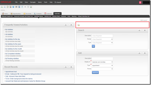
4) On Home pages having Search, Add and Go the labels being wrapped to next line
Before: On Contact Home, we got Add and Go. The labels are shown with text wrapping. Looks bit odd.

After: It looks much nicer.

You can see this even on form applets too.
Above is a simple fix by adding a custom css on your theme and add below line and link to your theme.
.siebui-form-label {
        white-space: nowrap;
}
5) Varying Row Height on list applets containing columns with multi line texts
Before: If you have fields which run multilines like Address, Notes etc, you see the row height varying accordingly to number of lines.

After: Now you can see all rows in your list applet of same height.

Again simple fix using css as below.
.ui-jqgrid tr.ui-row-ltr td {
    height: 20px;
    padding: 0;
    text-overflow: ellipsis;
    white-space: nowrap; /* This is what is fixing it*/
}
7) Some large form applets not fitting within the screen and seem like cropped
Before: You can see Logistics Information form applet, a full column of fields missing on the right (you can’t seven see them) While, we are redesigning the layout to fit whole content within 50% of the space. A quick workaround is to enable horizontal scrolling.


After: Adding horizontal scroll. Users can scroll right to see the remaining fields. Not very user friendly, but still works1

Again a simple css fix,
div.siebui-collapsible-applet {
    overflow-x: auto;
}
Developers are working to fix the form applet layout individually where they are getting cropped. Hard work han? No workaround as of now other than horizontal scrollbar.
All in all, overall Open UI out of the box theme is coming along nicely with not many burning issues open. I will update with more findings shortly. Till then take care.
Cheers,
Shiv