Hi Readers,
Whaw! It's been 1.5 years since my last post. Due to my work commitments, I am unable to add more content here on my blog. Off late, I have been working on Oracle cloud products viz. Sales, service, marketing etc. My next venture will be on salesforce.com.
Hope my old posts have been helpful to a few of you. I may not be able to continue posting anything on Siebel as I am no more working on this technology. But, I will come back and redesign with new posts on SFDC on this blog.
Till then good bye :)
Regards,
Shiv
Siebel & Open UI
The intention of this blog is to share interesting findings about Siebel CRM and it's evolution.
Friday, 8 April 2016
Wednesday, 19 November 2014
Open UI IP 2014 is finally here! - First look is here - Is it truly responsive?
As most of you aware, IP 2014 is now available on eDelivery!
I was very eager to see the responsive web design part of it! So went ahead and downloaded and setup my sample. The first look – impressive layout. Though, in my case, it is opening only on firefox and IE11 (haven’t tried other IE versions). In Chrome it keeps spinning. You need to set
EnableFQDN = FALSE in your cfg for it to work!
Important Update:(From Alex on siebel-essentials) Please be aware that Patchset 1 for Innovation Pack 2014 will be mandatory for production use. Patchset 1 will be made available on My Oracle Support in due time (official GA). In the meantime, you can benefit from using the installers for evaluation and upgrade preparations and of course peruse the new documentation to learn about new features.
See the general navigation below.
MVGs back to how they were in HI!
Editing attachments inline – users are eagerly waiting for it! See it here.
Note: inline editing worked only on Firefox and not on chrome for me.
I am disappointed by the responsiveness. See here,
Above, you can see the list and form applets are pretty static. Only Logo, Menu, toolbar etc are dynamically changing. I was hoping much more as part of IP2014 on this. I was imagining List Applets to reduce in height and users will be able to scroll on list applet with their fingers on smaller devices. I was hoping Form Applets will adjust the layout based on the device size. It’s time for more explorations and custom PRs to make that happen!
More to come, hold on till then!
Cheers,
Shiv
Friday, 14 November 2014
Open UI - styling your form applets - add sections or tabs!
Most of the complaints you hear from typical Siebel users is that their screens are bulky, seeing a lot of unnecessary fields dumped into one big form applet. How about redesigning them so that you logically group only the relevant fields into one group and show only that group at a time.
I found Jquery UI has accordion and tab options to display content in group. See below to see them in action.

You can get Accordion demo on jquery ui site here: http://jqueryui.com/accordion/
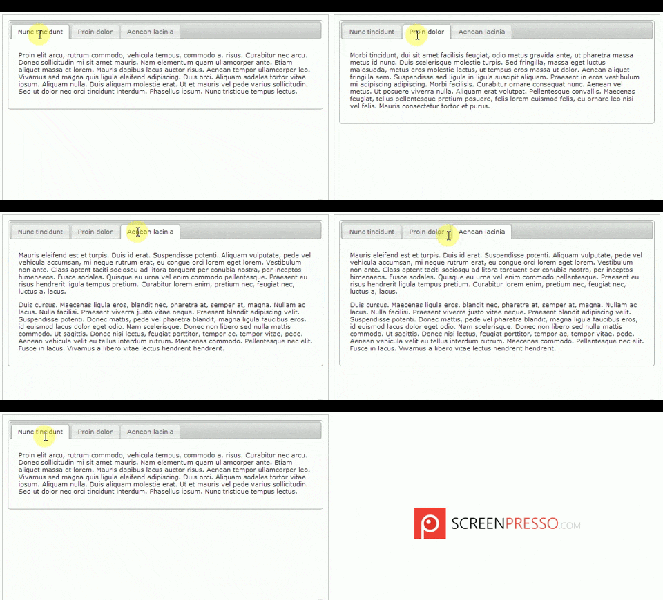
You can get Tabbed display demo on jquery ui site here: http://jqueryui.com/tabs/#mouseover
Go through their example to understand how they do it.
Now, I leveraged above in to my Siebel form applets and here is the outcome.
How to go about?
I found Jquery UI has accordion and tab options to display content in group. See below to see them in action.

You can get Accordion demo on jquery ui site here: http://jqueryui.com/accordion/

You can get Tabbed display demo on jquery ui site here: http://jqueryui.com/tabs/#mouseover
Go through their example to understand how they do it.
Now, I leveraged above in to my Siebel form applets and here is the outcome.
How to go about?
Tuesday, 11 November 2014
Siebel monitoring – build your own and of course free!
Taking a bit of a side track from Open UI topic here. There are very few of the shelf tools available in the market when it comes to monitoring your Siebel servers which can
- monitor servers and components at a micro level
- Alert admin users before your business starts complaining.
- Easily configurable
- a job which monitors the servers status and alert set of users by email if any of the server is not Online.
- a job which monitors set of listed components and alert users if any of them in trouble via email
use case 1: To monitor servers (by status)
The need:
At every 10 mins, (or at desired interval)
Wednesday, 29 October 2014
Open UI - Free Address Auto complete powered by Google API
If you are looking for a free address auto complete for your Open UI users, here is the solution. I am sure, this will compete with other paid services like Experian (QAS), Informatics etc for Address verification and validation services.
Present scenario:
Users manually enter address info, leading to inconsistent/incorrect data on the system.
With Autocomplete API integrated:
Users just need to search for the address and select it. System will do the rest - it will copy the standard address info from Google and auto-populates the address fields on Siebel.
Demo first.
High level technical flow:
Present scenario:
Users manually enter address info, leading to inconsistent/incorrect data on the system.
With Autocomplete API integrated:
Users just need to search for the address and select it. System will do the rest - it will copy the standard address info from Google and auto-populates the address fields on Siebel.
High level technical flow:
Friday, 24 October 2014
Google map integration with Open UI – route planning based on sales reps calendar!
Hi All,
I would love to update more often on my blog but unfortunately, my work load is pulling me back. While I was hiding from my blogging, was busy improvising our sales reps day to day operations by means of integrating their visits with Google optimized route planning.
Before you can understand the subsequent content of my blog, you need to understand the google map API itself. I am not going to go into that but provide you the link to explore your self. So, click on the image below and explore the Google map API.

Ok demo first. Please watch below video for an insight as to what I will be talking next.
The business scenario goes like this. As soon as your sales rep logs onto Open UI, he will be shown with his current appointments in the calendar applet and the corresponding locations are plotted on the map along with full direction details at the bottom of the screen.
How to go about it? (High level)
I would love to update more often on my blog but unfortunately, my work load is pulling me back. While I was hiding from my blogging, was busy improvising our sales reps day to day operations by means of integrating their visits with Google optimized route planning.
Before you can understand the subsequent content of my blog, you need to understand the google map API itself. I am not going to go into that but provide you the link to explore your self. So, click on the image below and explore the Google map API.

Ok demo first. Please watch below video for an insight as to what I will be talking next.
The business scenario goes like this. As soon as your sales rep logs onto Open UI, he will be shown with his current appointments in the calendar applet and the corresponding locations are plotted on the map along with full direction details at the bottom of the screen.
How to go about it? (High level)
Friday, 12 September 2014
Open UI – Common look and feel issues and work-around
It’s been a while I updated my blog. Got bit busy with Open UI rollout in my company. Through the journey, encountered some common problems for which you might as well be looking for solutions. Here are few to share with you.
1) iHelp error due to SI Applet
Before:
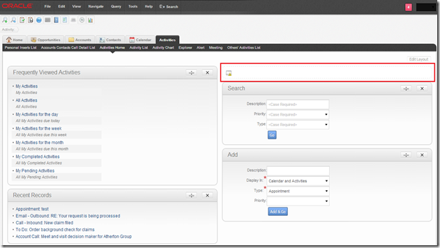
After:
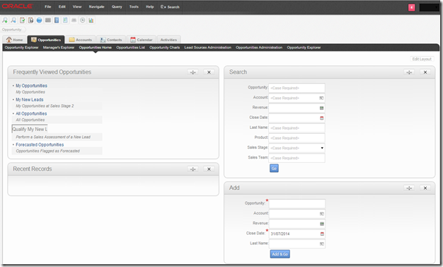
Please check my previous blog to remove iHelp error here.
2) Salutation error due to SI Applet
Before:


3) Applets not contained within the boundaries of the screen
Before:
Navigation: Sales Sample –> Account –> Account Summary – Prepaid. You can see below the Installed Assets and Current Balance taking almost 80% of the screen. If you add/remove columns displayed, you can see the list applet and the full left side of the stack growing/shrinking.

After: You can see now it is 50-50 proper split. Even if you add/remove columns the split won’t alter.

So the fix – unfortunately, this one goes into swt files. The view is: SIS OM Customer Account Portal View – Prepaid. The web template associated to this view is: CCViewParentMultiChildWithTabs.swt. This is the template we need to alter. Make sure you copy the file from /WEBTEMPL/OUIWEBTEMPL to /WEBTEMPL/OUIWEBTEMPL/custom. Now open the web template and you should find a structure somewhat like below.
4) On Home pages having Search, Add and Go the labels being wrapped to next line
Before: On Contact Home, we got Add and Go. The labels are shown with text wrapping. Looks bit odd.

After: It looks much nicer.
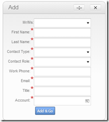
You can see this even on form applets too.
Above is a simple fix by adding a custom css on your theme and add below line and link to your theme.
5) Varying Row Height on list applets containing columns with multi line texts
Before: If you have fields which run multilines like Address, Notes etc, you see the row height varying accordingly to number of lines.

After: Now you can see all rows in your list applet of same height.

Again simple fix using css as below.
After: Adding horizontal scroll. Users can scroll right to see the remaining fields. Not very user friendly, but still works1

Again a simple css fix,
Developers are working to fix the form applet layout individually where they are getting cropped. Hard work han? No workaround as of now other than horizontal scrollbar.
All in all, overall Open UI out of the box theme is coming along nicely with not many burning issues open. I will update with more findings shortly. Till then take care.
Cheers,
Shiv
- iHelp error due to SI Applet
- Salutation error due to SI Applet
- Applets not contained within the boundaries of the screen – especially views like Account Summary -containing 50-50 split for applets
- On Home pages having Search, Add and Go the labels being wrapped to next line.
- varying Row Height on list applets containing columns with multi line texts
- Anchor tags not coming with underline and default blue colour
- Some large form applets not fitting within the screen and seem like cropped
- Let’s go through the workarounds for above now.
1) iHelp error due to SI Applet
Before:

After:

Please check my previous blog to remove iHelp error here.
2) Salutation error due to SI Applet
Before:

After:

Please check my previous blog to fix salutation error here.
3) Applets not contained within the boundaries of the screen
Before:
Navigation: Sales Sample –> Account –> Account Summary – Prepaid. You can see below the Installed Assets and Current Balance taking almost 80% of the screen. If you add/remove columns displayed, you can see the list applet and the full left side of the stack growing/shrinking.

After: You can see now it is 50-50 proper split. Even if you add/remove columns the split won’t alter.

So the fix – unfortunately, this one goes into swt files. The view is: SIS OM Customer Account Portal View – Prepaid. The web template associated to this view is: CCViewParentMultiChildWithTabs.swt. This is the template we need to alter. Make sure you copy the file from /WEBTEMPL/OUIWEBTEMPL to /WEBTEMPL/OUIWEBTEMPL/custom. Now open the web template and you should find a structure somewhat like below.
<table datatable="0" summary="" bgcolor="#ffffff" width="100%" border="0" cellspacing="1" cellpadding="3"> <tr valign="top"> <td colspan="3"> swe goes here </td> </tr> <tr valign="top"> <td width="50%"> swe for three left side applets go here </td> <td width="50%"> swe for three right side applets go here </td> </tr> </table> The trick here is to set the css styling to have table-layout:fixed for the table that shows applets in 50-50 split. Since in this case within <table> tag, we have two <tr> we need to have split into two tables for it to make it work. Somewhat like below, <table datatable="0" summary="" bgcolor="#ffffff" border="0" cellspacing="1" cellpadding="3" style="width:100%;table-layout:fixed"> <tr valign="top"> <td colspan="3"> swe goes here </td> </tr> </table> <table datatable="0" summary="" bgcolor="#ffffff" border="0" cellspacing="1" cellpadding="3" style="width:100%;table-layout:fixed"> <tr valign="top"> <td width="50%"> swe for three left side applets go here </td> <td width="50%"> swe for three right side applets go here </td> </tr> </table> After the changes the file should look like this - CCViewParentMultiChildWithTabs.swt | |||
4) On Home pages having Search, Add and Go the labels being wrapped to next line
Before: On Contact Home, we got Add and Go. The labels are shown with text wrapping. Looks bit odd.

After: It looks much nicer.

You can see this even on form applets too.
Above is a simple fix by adding a custom css on your theme and add below line and link to your theme.
.siebui-form-label {
        white-space: nowrap;
}
5) Varying Row Height on list applets containing columns with multi line texts
Before: If you have fields which run multilines like Address, Notes etc, you see the row height varying accordingly to number of lines.

After: Now you can see all rows in your list applet of same height.

Again simple fix using css as below.
.ui-jqgrid tr.ui-row-ltr td {
    height: 20px;
    padding: 0;
    text-overflow: ellipsis;
    white-space: nowrap; /* This is what is fixing it*/
}
7) Some large form applets not fitting within the screen and seem like cropped
Before: You can see Logistics Information form applet, a full column of fields missing on the right (you can’t seven see them) While, we are redesigning the layout to fit whole content within 50% of the space. A quick workaround is to enable horizontal scrolling.
After: Adding horizontal scroll. Users can scroll right to see the remaining fields. Not very user friendly, but still works1

Again a simple css fix,
div.siebui-collapsible-applet {
    overflow-x: auto;
}
Developers are working to fix the form applet layout individually where they are getting cropped. Hard work han? No workaround as of now other than horizontal scrollbar.
All in all, overall Open UI out of the box theme is coming along nicely with not many burning issues open. I will update with more findings shortly. Till then take care.
Cheers,
Shiv
Subscribe to:
Comments (Atom)
